Description:
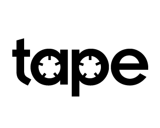
This is a logotype we whipped up for Seattle Hip-Hop Producer, Traq Addicc. In designing the logo, we wanted to take his producer name - Traq Addicc Productions Entertainment - and give him a mark based on the acronym. It's a good thing the 'a' and the 'p' have circular counters!
The typeface used is Insignia, which was designed in 1989 by Neville Brody. His designs received international recognition for their innovative, computer-oriented style, reaching almost cult status. Insignia has the basic forms of constructed grotesque fonts and was influenced by the New Typography of the Bauhaus during the 1930s. Its image reflects the Zeitgeist of that age, suggesting technology and progress.
With all that geeky history relating to technology, and Insignia's 'a' and 'p' letterforms having near perfect circle counters (and the 't' looks like a turntable arm!), there was no other choice for us than to go with this typeface. The client was happy, and the identity is currently being carried throughout their material.
Check 'em out over at www.traqaddicc.com
As seen on:
Traq Addicc
Status:
Nothing set
Viewed:
15708
Share:



Lets Discuss
this is excellent - fantastic - tapes though - they don't make those any more do they?
Replysorry for double post - just wanted to add, that it almost seems as if the tape wheel is turning - very striking
ReplyHey they may come back ... history does repeat itself. Remember winding them back up with your finger?
Replyhaha.. i actually don't think they still do make tapes? their acronym for their company really stood out, and seems a bit dated for a music production company in 2008. we went with it, they are really happy. job: successful :)
ReplyGreat, elegant mark. As a sidenote, I studied with a colleague of Neville Brody in college. Amazing designer.
ReplyNice concept.
ReplySimple, clever and on point. Nice.
ReplyI love this, but my only comment is that the circle of the P is slightly to the left and it bugs me. Other than that a great concept.
ReplyExcellent solution.
ReplyOutstanding work. Great use of the type.
ReplyGood concept but the holes are off centered from the circle. Would been better if that was fitted better or on a other font.
Replya beauty!
Replylike! :)
ReplyPlease login/signup to make a comment, registration is easy