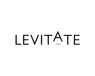
Float
(Floaters:
9 )
Description:
The A transcends in a state of levitation. Trying to keep the type light.
Status:
Nothing set
Viewed:
7155
Share:




Lets Discuss
hhhmmmm.... nice-ish idea... how about if you had the tops on the E's %26 T's raised slightly instead... just a thought...
ReplyThanks Nido. I'll try that.
ReplyThanks Nima :-)
ReplySimple and clever. I like it.
ReplyThe shadow is too high. Current shadow placement implies that A is not only higher than other letters it is also farther from the viewer. But in this case it should be smaller too, but it is not, so the whole thing looks a bit inconsistent.
ReplyThanks cseven :-)**I see what you are saying epsilon ... I'll fix that.
ReplySimple, yet effective.
ReplyPlease login/signup to make a comment, registration is easy