Little Box Of Ideas
by lboi • Uploaded: Mar. 04 '09

Float
(Floaters:
3 )
Description:
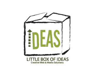
a very clean and simple logo using the classic "century" font, the thought cloud represents the thinking process, the exclamation mark represents "I got an idea!" and the color symbolism behind green is "green ideas that are functional, that work".
As seen on:
LBOI
Status:
Nothing set
Viewed:
2817
Share:


Lets Discuss
I agree, the Century font is good for this.*If used as a logo, it is too wide.*The tittle on the %22i%22 in ideas should be solid.*Tilt the exclamation point at an angle.*Try stacking the words somehow.*
ReplyThnx for your feedback .. I can see how making %22i%22 solid would enhance it, must try it! The exclamation is actually tilted in the original logo on the design page .. just not in this version. :-)
ReplyPlace %22!%22 instead of %22I%22, e.g. !deas.
Reply%5Egood idea.
ReplyPlease login/signup to make a comment, registration is easy