Elevate Difference V1
by lboi • Uploaded: Aug. 04 '10

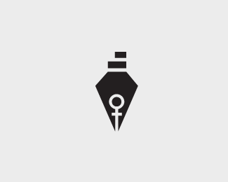
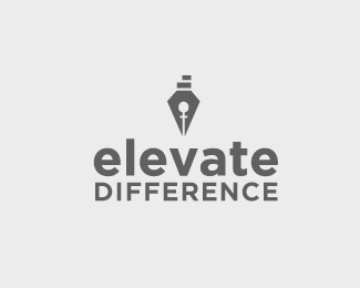
Float
(Floaters:
7 )
Description:
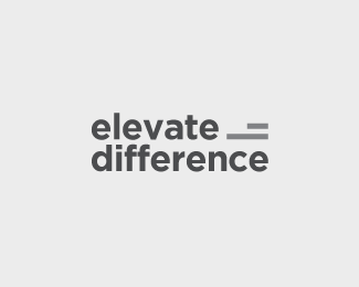
A logo mark for a publication driven by women writers. They strive to celebrate "difference" of opinions.
Using negative space in this one. WIP
Status:
Work in progress
Viewed:
5067
Share:
Lets Discuss
Really nice Sneh. Great use of negative space
Replygreat %3B)
ReplyThanks Duane %26 Andreas :)
ReplyI like it, but can you explain the two bars on the top?
ReplySeems to be heavily inspired by %22http://www.gfw.co.uk%22:http://www.gfw.co.uk
Reply@epsilon first time I saw it. The client's specification was a literary device and nothing says it better than a pen/nib**@jvajko The name of the publication is %22Elevate Difference%22. The symbolism behind the two bars on top besides blending to form the body of the pen is %22elevate%22 (steps) and %22difference%22 (an equal sign that is not an equal sign).
ReplyI was just going to say... VERY close to that GFW logo. On its own, it's nice, but it's way too close for comfort, in my opinion. The GFW logo has been featured on a lot of logo design blogs as a shining example of negative space, so a lot of people (within this community anyway) are going to be familiar with it already.**Also, I don't think the %22step%22 symbolism on the top works. It makes me look up there, but not in a good way. It doesn't immediately come across as a step, and I feel like it has to be explained. I actually thought it was a strange attempt to add dimension or shadows up there.*
ReplyThe Guild logo was a part of a collection of notable neg space logos that made rounds through social media about a year (or maybe two) ago. For this reason the logo could be considered %22famous%22 even in a non-designer circles and what I said above would be a typical first reaction of someone who have seen it. Just something to keep in mind I guess.
Reply@adambomb I hear what you are saying. I initially provided variations with just the nib and a cross-section of the nib, but the client seemed to favor the one that had the %22unequal%22 equal to sign. My original logo for the client also had a more detailed %22female symbol%22 in the negative space, but the client prefers this subtler one (I have also posted the other variations here).**@epsilon Thanks for the heads up. I should've seen it ( I blog about food for heavens sake :)) but missed it. This logo is a progression from a section of the nib embedded with the female symbol to incorporating the full nib at the client's preference.**Cheers!
ReplyPlease login/signup to make a comment, registration is easy