Description:
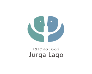
Logo for psychologist Jurga Lago (woman). You can see the letter "psi" (Ψ) in the negative space - it is the symbol of psychology. In the positive space you can see two human figures facing each other - these figures symbolize therapy process. If you are lucky, then you can also see a flower, hands, two open mouths :) And also there is a symbolic metaphor for theraphy - one path which divides into 3 new paths (new posibilities, insights etc.).
As seen on:
Logotipu kurimas
Status:
Client work
Viewed:
24571
Share:

Lets Discuss
Pretty clever mark. I dig it. But the overall layout isn't working for me. Play with scale and proximity a bit maybe.
ReplyI altered proportions. I think it's better now. Thanks for comment.
Replyooh. psi. clever.
Replyvery nice. great psi idea
Replyalways liked dis guy
ReplyHave to agree with logoboom here for a change :)*
ReplyI love the mark, but the larger type is lacking. Specifically, it just doesn't seem to go well with the beautiful serif. Maybe something with a little more %22oomph%22 to it. Something more unique than Myriad Pro (or whatever the face is) and the same serif font, perhaps?
ReplyI have had different versions prepared for the client. But she choose this combination. BTW this psychologist is practising Humanistic psychology and the larger type is %22Humanist%22. The serif type is a simple %22Times New Roman%22.
ReplyClever, i really like this kind of logos.
Replygerai padirbeijai. taip ir toliau
ReplyNice!
ReplyCool...
Replygenial
ReplyGreat! love the way you use the negative space. is there any meaning in the colors?
ReplyPlease login/signup to make a comment, registration is easy