Description:
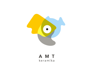
Logo for online 3D building game where people in multiplayer mode build virtual worlds. Triangles and rectangles are the main forms used for building.
As seen on:
Logotipu kurimas
Status:
Work in progress
Viewed:
2511
Share:


Lets Discuss
nice one- love it
ReplyNice composition and layout. Only suggestion I'd make: round off the corners of that triangle, just subtly enough so they're not so sharp, but still show as tips of the triangles. Sharp angles disrupt visual flow of the eye over the graphic%3B slightly rounded corners show refinement of a concept, which is good. Plus, with this design, you have a lot of 'rounded elements'%3B it'd help the triangle fit with the rest of your design.
ReplyThanks for comment and suggestion. I tried it - http://www.efektyvusdizainas.lt/svrounded.png**I'm not sure which one is better. I worry that rounded corners diffuse the triangle.
ReplyI vote rounded.
Replyi think it should be like this, looks realy good, and type is not rounded...so:)razus darbas Giedriau %3B)
ReplyMalonu, kad patinka :) Tikiuosi, kad patiks ir uzsakovui...
ReplySaw that one, and after seeing it, looking at this one...makes the triangle look even more separate from the design than it did before, at least to me. It sticks out, and takes away focus from the overall composition I believe. Other way...more blended, and a more balanced design overall.
ReplyJF, I used your suggestion in another logo and it worked just perfectly :)
ReplyPlease login/signup to make a comment, registration is easy