SyncroVive
by kovalenkoserhiy • Uploaded: Feb. 02 '17

Float
(Floaters:
6 )
Description:
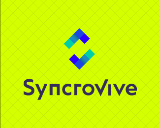
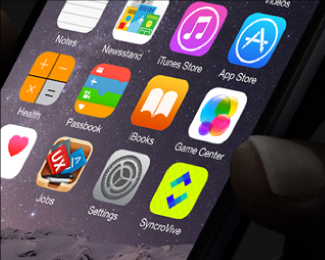
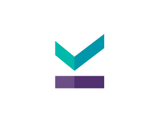
Logo design for a mobile calendar app focused on linking people to find mutual free time to save time planning and help make meeting up more efficient.
The SyncroVive logo consists of these symbols: S letter, two V letters, the tick and calendar cells.
One of the main things that the logo symbol portrays is the idea of synchronisation. It is created by the two identical objects invisibly connected with each other and moving around simultaneously in the clockwise direction. The two shapes give an idea of social interactions and constant communications. The movement of the shapes creates a dynamic feel of the logo and explores an idea of free minded life with little restrictions. The square cells represent the calendar dates being structured, organised and synchronised in an easy, time-saving and efficient way.
Status:
Client work
Viewed:
13658
Tags:
wordmark
•
planner
•
scheduler
•
links
Share:


Lets Discuss
Nice design.
ReplyPlease login/signup to make a comment, registration is easy