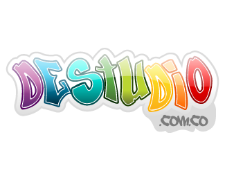
Destudio Prop1
by koriman • Uploaded: Mar. 19 '08

Float
(Floaters:
0 )
Description:
This is a logo proposal for a educational web community oriented to students from elementary to high school
Status:
Nothing set
Viewed:
1615
Share:


Lets Discuss
i dig the colors and graffiti style but im not a fan of the gloss thing.**1. it doesnt make any sense on graffiti letters because you cant do it in real life. *2. the %22web 2.0%22 look is way to trendy AND its on its way out. more and more people are finally letting go of that look so id hate to see a something new still doing that.**just my opinion. great logo but i hate the gloss thing and not just on your logo. i just hate it period now because it was so over used and put on everything. case in point. put on something that doesnt need it and in real life could never have it
ReplyHey sparksmemphis, you really have a point there. The %22web 2.0%22 style is dying and too much used. I was just trying to explore the combination of that style with the graffity style, but you%B4re right, It didn't come out well. **Anyway, the client didn't aprove this proposal. I really try to pull a good one but i couldn%B4t. :(**I really appreciate your comments and sugestions. I think is a good logo without the glossy thing...
ReplyPlease login/signup to make a comment, registration is easy