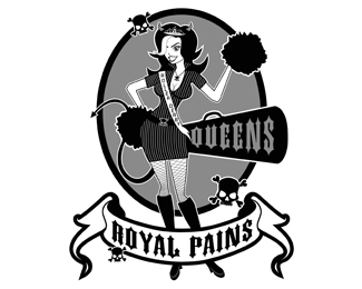
Description:
This is for a Rollerderby Jeerleading team, located in Queens, New York.
As seen on:
Status:
Nothing set
Viewed:
1444
Share:




Lets Discuss
I think there's too much detail happening in this logo (i.e., the pinstripe uniform, the stockings, the type on the sash, etc.) which will fill in at smaller sizes. I'm also having some issues with the bullhorn extruding from her ass. I think this logo would be much more effective with a more streamlined illustration style.
ReplyI agree, but that's what the client wanted. If you look at their myspace page, that's exactly how their uniforms are.
ReplyClients suck sometimes.
ReplyPlease login/signup to make a comment, registration is easy