Float
(Floaters:
0 )
Description:
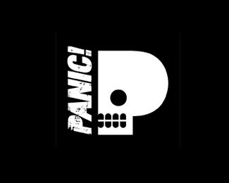
Logo for new club night in Limerick
Status:
Client work
Viewed:
1198
Share:


Lets Discuss
I think you're on the right track with the P/skull, but there is quite a discordant relationship between type and icon. For one, the skewed type next to the static skull looks odd. If you feel the type needs to be skewed to give it more onomatopoeia, I would also skew the right side of the skull upward, so that the resulting shape (the combination of type icon) looks like an isometric rendering of a P. Also, I don't know if the grunge effect on the type is necessary, but if you intend on keeping it, you should apply the same grunge effect to the skull. I would also try using the P from your type as the skull. It would help unify type and icon.**And actually, have you tried this as a wordmark without the icon? You could get rid of the icon altogether, and make the P in the word Panic into a skull. This might be a cleaner execution.
ReplyThanks man. These were my exact sentiments. I approached the client with two different logos, one with the P-skull and Bebas Neue running up the side and one with the grunge type. He liked them both and wanted to combine the two (as usual).
ReplyOr maybe if the word PANIC formed the teeth? Not sure if that would work. You might also add a skull nose to make it a bit more clear - I didn't see the skull right away. Great concept!
ReplyHoly Blast From The Past, Batman! I just googled Panic! and it looks like the logo is in use.
ReplyPlease login/signup to make a comment, registration is easy