SAGA l
by kek • Uploaded: Feb. 11 '12

Float
(Floaters:
15 )
Description:
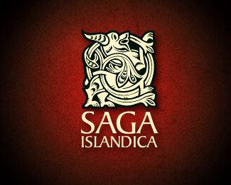
As it didn't win the contest for a mark for the National Museum of Iceland I reused it later as a logo for a Icelandic Souvenir and manufacturer.
A fine logo won the contest though: http://www.thjodminjasafn.is/
Status:
Client work
Viewed:
2752
Share:


Lets Discuss
yes, float and favs...
ReplyI love the mark. Don't like the text. Font needs to be thinner, smaller, not so tightly kerned and the same color as the mark.
ReplyThx
Replythe mark is fantastic, love the style. agreed with above, font is getting beat down by the mark.
Replylike the symbol, agree that the font need some love, and the color of the font as well, IMO.
Replyvery beautiful, I like the details :D
ReplyThx abdelghany :-)
ReplyPlease login/signup to make a comment, registration is easy