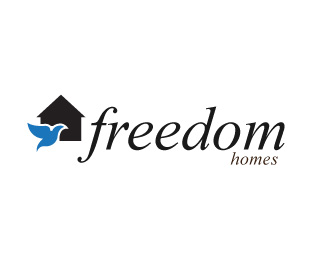
Description:
Working on logo for Custom Home Builder.
I feel like I have come further from my previous design but it still does not feel custom home builder to me.
Any pointers or help would be greatly appreciated =)
previous design:
http://logopond.com/gallery/detail/15200
Status:
Nothing set
Viewed:
1369
Share:




Lets Discuss
I think this is your best so far. It feels the most original. Keep up the good work.
ReplyThanks OcularInk, I think tonight I am going to try working on giving the bird/house some depth and see how it looks
ReplyI hope you mean depth as in meaning and not as in 3d %3B%5E)
ReplyPlease login/signup to make a comment, registration is easy