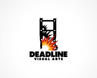
Description:
This is for a friends production company.
They makes short action movies on a very small budget.
My first proper logo.
Website coming soon...
As seen on:
Status:
Client work
Viewed:
6224
Share:


Lets Discuss
The idea is great! I like how you've managed to create a building by using the film negative. However the style of the explosion doesn't feel right. Maybe it can be a little less cartoony? Try bringing in a little more depth by drawing inspiration from a real explosion. Something about the font for 'VISUAL ARTS' doesn't feel right either. A little more development to this concept, and it'll be really nice!!
ReplyI've been wondering if I should change the visual arts text or not. It doesn't look great.**As for the explosion I'm not sure I can manage anything much better then this, tried several versions already. If I have the time I'll try some other variants of an explosion but the text I'll do something about atleast, thanks.
ReplyPlease login/signup to make a comment, registration is easy