One
by kaimere • Uploaded: Jan. 06 '10 - Gallerized: Jan. '11

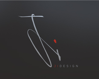
Float
(Floaters:
53 )
Description:
Restaurants nightclub identity... the O is the restaurants logo an the line is 1 in quite a few languages ...
Status:
Client work
Viewed:
10870
Share:


Lets Discuss
Great stuff, Mike! Is it for a restaurant?
ReplyThanks Sean in a roundabout way yeah it is ... cant say until the 15th thou
ReplyBeautiful stuff!
Replycheers Chad
Replyintriguing stuff indeed... do I see a wahid on its side?
Replyvery interesting..
Replyheheh nice spot nido since chinese is based on arabic to a degree lol ill give ya a point
Replyi should update the description on this
Replynot ordinary for restaurant - nice idea
Replycool thing!
Replyvery cool. classy.
ReplyI agree, I like that a lot.
Replyreally beautifull
ReplyOne nil to the spurs!
ReplyOne of my favorites!
Replymany thanks for the comments guys - happy new year to all
Replyvery understated, lovely stuff!*My only worry is the size of the type on the ONE bit.... and the light font chosen too must mean this is going to be pretty tricky to read at certain sizes....
Replycool
ReplyVery nice Mike! Nice classy look about it.
Replythis actually looks a lot like the Greek uppercase theta: Θ
ReplyI guess logopond does not support Greek letters. Google 'theta' to see what I meant
ReplyExcelent, nice one!
Replylooks delicious
Replygreat one! simple and nice!
ReplyNice one!
ReplyThanks guys :)
ReplyClean, and kinda of sexy. Makes me think of chocolate. Love the type.
ReplyPlease login/signup to make a comment, registration is easy