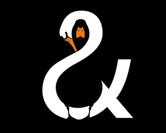
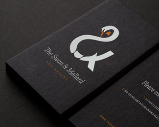
The Swan & Mallard
by jwrandall • Uploaded: Jul. 12 '15

Float
(Floaters:
5 )
Description:
The identity plays upon the three aspects of the restaurants name by unifying the swan and the mallard through the positive and negative space within the ampersand. A limited colour palette and minimalistic style helps create a simple yet balanced feel. This logo is designed to be memorable by aiming to create a smile in the mind of those that see it.
As seen on:
Béhance: jwrandall
Status:
Client work
Viewed:
6776
Tags:
creative
•
idea
•
duck
•
double
Share:
Lets Discuss
That's clever! I like it.
Replyagreed. I like it too!
ReplyLooks a bit awkward though.
ReplyPlease login/signup to make a comment, registration is easy