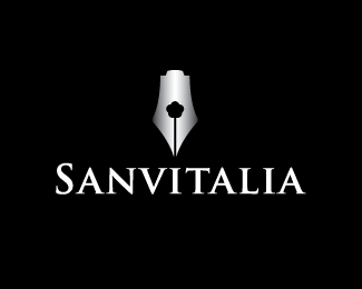
Sanvitalia White
by jveres • Uploaded: Jul. 31 '09

Float
(Floaters:
3 )
Description:
Logo for book publishing company.
Status:
Unused proposal
Viewed:
4180
Share:


Lets Discuss
A bit close to Food Writers: *http://www.gfw.co.uk/
ReplyHave you tried bringing the flower image out a bit more? Perhaps the pedals can be more defined and you can add a leaf or two on the stem. This might help differentiate it from the logo linked above.
ReplyWhat firebrand said.
ReplyAgree with Firebrand, but mostly to what Ocularink stated. It looks nice, but you can shape more into a more original stand alone result.
ReplyI never seen Food Writers logo but thank you for warning :) Thank you
ReplyI actually think this logo looks more refined and has a better execution than the food writers logo. Theirs looks like a simple pen nib, lacking any real identity. *Besides, it's almost impossible to be original. Almost everything has been done before. I like it
Replyi agree with drajax, nice execution...**but i didnt even notice the flower until stated by ocularInk. i think it could be given more definition
ReplyPlease login/signup to make a comment, registration is easy