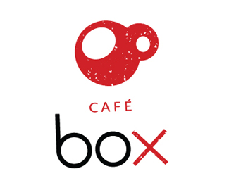
Café Box
by juls84 • Uploaded: Jun. 08 '08

Float
(Floaters:
3 )
Description:
a logo for a modern café...
any tipps?
Status:
Nothing set
Viewed:
1024
Share:
Lets Discuss
I would like to see the cup and text set within a square box without rounded corners. I'm not too sure about the spatters either. Nice style overall though :)
Replyi thought of boxing gloves when thinking of the mark in relation to the name. instantly assumed it was a sports themed cafe/bar. Is this the intention??
ReplyNot crazy about the color break on the X. Brings too much attention. Those ascenders are also really really long to have a box sitting over them. Love the mark.
Replythank you guys. **it should not be a sports caf%E9. box is a shortcut for two german words. so the red X is important for the meaning. ***
ReplyNicer without splatters maybe? maybe not? And perhaps the top of cup a bit bigger so the edge doesn't look too thick and less round (unless it's actually the bottom of the cup.) %0D*%0D*Striking!
ReplyWhen I saw it at first, it looked like bloodshot googley eyes, which made me think of someone wired of coffee.
ReplyI saw mother and baby olive.
ReplyPlease login/signup to make a comment, registration is easy