Julio Granados
by juliogranados • Uploaded: May. 25 '07 - Gallerized: Dec. '07

Float
(Floaters:
15 )
Description:
Graphic Designer & Illustrator
Status:
Nothing set
Viewed:
4707
Share:


Lets Discuss
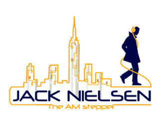
Stretching the initials/wheels concept abit, but it works! Great colours too!
ReplyI like the idea, the type %26 the colours - the figure %26 bike could perhaps be simplified a bit more, but that's just my minimalist attitude %3B%5E)
ReplyReally a fun design - it made me smile the moment I saw it on the gallery page. Making the J and G a bit rounder as wheels might result in a stronger image - as it is now, this guy is in for a bumpy ride. :o)*
ReplyYes, rounder wheels to go faster. The scarf is a touch of genius!
ReplyYea, the scarf is a clever touch.**Lol @ Jeff %22as it is now, this guy is in for a bumpy ride. :o)%22 I agree with his comment about the wheels.
Replyi dont see nothing in this logo, sorry, too complex
ReplyHa Ha, %22BUMPY RIDE%22 yeah, Why did you not design with rounder characters?, especially if your a graphic designer and illustrator.
ReplyI love the colors and the overall concept. But, I agree with the others: this needs rounder characters to really work.
ReplyPlease login/signup to make a comment, registration is easy