Redhill Media
by juicestain • Uploaded: May. 12 '09

Float
(Floaters:
2 )
Description:
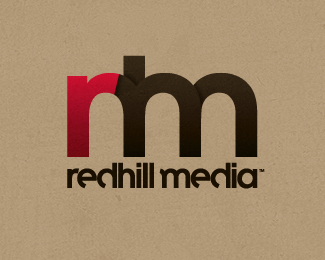
First draft concept logo for video production company.
Looking for feedback, please comment.
Status:
Nothing set
Viewed:
2056
Share:
Lets Discuss
I've seen similar r m combination being used for a personal logo by someone on typophile.com forums, presumably a graphics designer. His version had %22r%22 overlaid on top of %22m%22 instead of being prepended to it, but treatment wise (r done in a different color) it was exactly like yours.
ReplyThanks for the info epsilon. I don't doubt this has been done before (it's an easy solution and has undoubtedly been done for every combination of initials/letters imaginable). I'm mostly interested in whether or not people like the execution, colors, modifications to type face, etc. Does it feel like a video production company logo (maybe too abstract or esoteric of a question)? **I've got another version in the works that incorporates the ascender of a lowercase %22h%22 (as per request by my colleagues). As well as additional %22stacked/overlapping%22 letter shapes (don't know if I'm explaining myself well).**I'd love some comparison input when I get that one up shortly.
ReplyBy the way, if you happen to find the logo you mentioned please link me to it, I'd like to see his take. I've searched google images for %22rm logo,%22 and though there are many, I haven't come across any quite like mine. Still I'm always interested in other designers outcomes for similar logo/design situations.**Cheers.
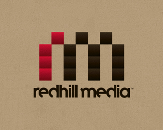
Reply%22New version here.%22:http://logopond.com/gallery/detail/63265**Individual or comparative feedback very welcome.
ReplyPlease login/signup to make a comment, registration is easy