Description:
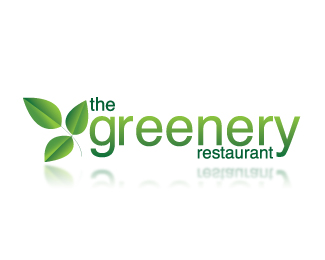
I re-designed The Greenery Restaurant. The original logo was just typographic image all done in Helvetica. What I done is I kept the logo in the Helvetica type and just added an illustration of some leaves to the side of the word Greenery and then I placed the word "the" in between the "G" on Greenery. The original logo was just black font. I added dark green to the word "the" and "restaurant." Then I added a gradient to the word "greenery." Then I took the leaves and added a gradient to give them a more 3d realistic feel.
Status:
Unused proposal
Viewed:
2970
Share:

Lets Discuss
I really like this logo. I like the gradient that you used on %22greenery%22 and you did a fantastic job on the leaves. :%5D The only thing that is a slight disconnect so-to-speak is the %22the%22 ... maybe if it were a little smaller? I love the placement of the %22restaurant%22. Great job!
ReplyHello! I particulary feel it's too crowded, you can simplify it and remember, don't rely on gradients or effects. G luck!
ReplyLove it. The leaves are perfect, the typography is great. I'm not really sure this screams %22restaurant%22, Might just be me. Also, I agree with jmrygh, the %22the%22 needs to be a lighter shade of green.
ReplyLike I told ya before, this is probably the strongest one of the three or so that you did, but I agree with Eathen, when you first told me what you were doin and I saw the first logo, I thought greenhouse, with that said...i think you did a pretty good job.
ReplyI like the logo, the typography is great but I do agree with everyone that %22the%22 needs to be smaller or a lighter shade of green. It doesn't really say restaurant to me though but it could work.
ReplyPlease login/signup to make a comment, registration is easy