
Float
(Floaters:
5 )
Description:
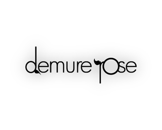
This is a logo for a percussion mallet-making company.
Status:
Unused proposal
Viewed:
2033
Share:





Lets Discuss
Very cool. Nice work.
ReplyI like this version best. Feel timeless. And it would imprint on a mallet well in the narrow space.
ReplyAgree with logoboom. It really is the best, in my opinion.
ReplyThanks to both for your input! It's interesting b/c I don't think I like this one the best, yet it draws me back for some reason. And yes, logoboom, you are exactly right: it would imprint on the mallet well...I just really like the graphic look of the circle ones...
Replyoh and i liked the ones with the ll's that are mallets, but no one seemed to like it!
ReplyReally, this one could have been designed today or 50 years ago. It is perfect. The one with the LL's that are mallets appears to be trying too hard to be clever and gimmicky, where this one isn't trying at all and comes off sophisticated and well thought-out.
ReplyIt's unanimous!
ReplyFlight fan makes some excellent points!
ReplyHMMMM, thanks, guys for the comments/thoughts!!! I really appreciate it...I'm a very indecisive person...you're making it easier!
ReplyWe just realized this looks just LIKE Mike Balter's logo: http://www.mikebalter.com/ (but in my opinion, it's better. LOL!)
ReplyPlease login/signup to make a comment, registration is easy