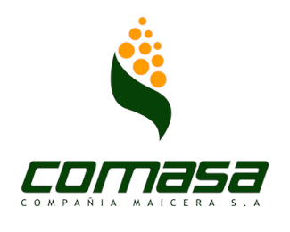
Float
(Floaters:
3 )
Description:
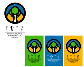
Mark designed for producting company of maize.
Status:
Nothing set
Viewed:
4664
Share:

Lets Discuss
This logo is new on market. i spect your suggestion
ReplyI like the mark but sorry to say that this kind of %22futuristic%22 font doesn't find an echo to me. I mean it deserves the goal to make it professional... This font is too hesitating with its square corners and 2 different round ones... It looks like this is a freebie font... Also, don't really think you need italic... May be curves of the mark could be, improved, especially top external ones.
ReplyHi Thomas.%0D*Thank you very much for your suggestions. %0D*The motive of the futurist source, I see that adapts well enough to the image, which this is simple enough and with outlines extremely minimalistas. I expect to be able to converse with you in a close opportunity. Regards from Bolivia
ReplyI love the logo mark. But I do agree with Thomas that a better type solution would help. It's still very nice.
ReplyThanks OcularInk :)%0D*%0D*Regards from Bolivia
ReplyI think you should take a look at http://www.tortilladorasautomaticas.com.mx because I think perhaps somebody has used or \"inspired\" to create a similar logo. About the logo I find it very well synthetized, but agree with the others about the type. Anyway, great work!
ReplyPlease login/signup to make a comment, registration is easy