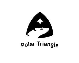
Description:
Polar Triangle is a company which takes you on a sailing journey to the arctic pole covering 3 destination points on the way. What a great experience!
Status:
Work in progress
Viewed:
4181
Share:



Lets Discuss
What an adventure. What a logo! :-)
Replyreally great
ReplySi, Yelds - thanks for the comments and floats
ReplyJust a thought - what if the text was upper cased and snugged below the triangle following the curve of the lower line and then enclosed with one more overall outline element into a crest-ish format? It would maybe get a bit more powerful and balanced with this very nice bear silhouette.
ReplyYes I have a version like this where the title is UC and following the shape. Will revisit and upload shortly. Thanks T08
ReplyCompletely agree with Type08. Hope to see the revision soon.
ReplyThis is gorgeous. Did you start with Diavlo?
ReplyThanks Tristan. How do you mean start with? It's a typeface which has some characteristic curls on the ends of each letter similar with that of the logos features, so I selected Diavlo on that strength really.
ReplyIt works really well with the graphic. Your work is very impressive.
Replyhey Jonnyd...It would be better if you don't cut his neck....hmmm I guess....*But I love it anyway!
Replybrilliant work !!
Reply%5E Bernd, Hanuman, tristanvogt ... thanks guys
Replyi have doubts abuot this smaill cut ob bear neck.and a am not the first one :) but i really like it
ReplyPlease login/signup to make a comment, registration is easy