Float
(Floaters:
1 )
Description:
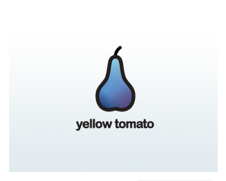
Logo for a media marketing company (oriented to internet)
Status:
Nothing set
Viewed:
1286
Share:


Lets Discuss
That's not how you should draw a yellow tomato. It looks like a blue pear to me, but that's just my opinion.**Seriously though, I kinda like it. It made me smile. I would remove the purple looking gradients though, they look like bruises.
Replyi don't think this works because just by reading the company name gives me an automatic visual in my head, and a purple/blue pear is not it. i like your other concept more.
Reply:) Don't you get the ironic idea? Of course it is a blue pear.....
ReplyI understand you were trying to go for ironic or clever, but i think for the marketing company, the idea may fly over their potential client's head. you know what would be kind of cool, a bottle of mustard. it looks like ketchup, and it's yellow. just my thoughts :)
Replyit made me smile too. but just as Yglo, i would get rid of the gradients, the lines of the pear look too simple for %22fancy color effects%22.
ReplyPlease login/signup to make a comment, registration is easy