J + M Updated
by jmutton • Uploaded: Aug. 18 '10

Float
(Floaters:
3 )
Description:
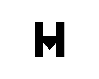
Mark has been updated with a different type.Idea for my personal mark.Comments?
Status:
Nothing set
Viewed:
4029
Share:


Lets Discuss
I like where this is going, but I think you could make it work a little better with a different font. I can't pinpoint why, but this one doesn't feel like it does the job as well as it could.
ReplyYeah I think I like this one the best so far. Finding it a bit tricky to like anything I design for myself, having crap initials does not help lol. I have not actually played around with other fonts on this one yet but will do!
ReplyI know what you mean. I've been having the same problem. I'm trying to do a self-identity and I'm definitely my own worst client. I posted a few in my showcase and on the forum, but I'm not totally happy with them and I haven't gotten glowing comments on any of them, so I think they must suck. Haha.
ReplyI know exactly how you feel, I'm my own worst enemy! However don't give up keep trying. I've been racking my brain for a few weeks over this!
Replyme too...%3B-) the own identity is propably the most difficult one...
ReplyJust done an updated to this one, what do you think now?
ReplyIt's legible, but it's less memorable this way, I think. It doesn't register immediately as rotated J's like it did with the serif font.
ReplyI like it. In the same condition i came up with this:
Replyhttp://logopond.com/gallery/detail/207971
Please login/signup to make a comment, registration is easy