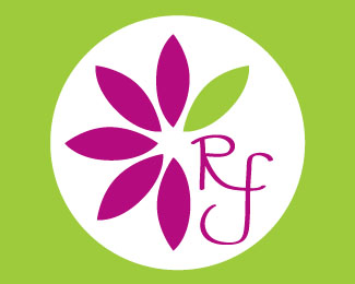
Reed Floral 1
by jmrygh • Uploaded: Apr. 27 '10

Float
(Floaters:
5 )
Description:
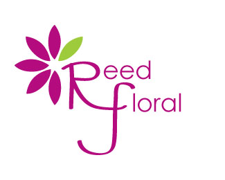
The client's current logo is a bold brush stroke "Reed Floral" beside a bouquet of roses. The logo I created is a new, modern identity. The colors I chose are fresh and vibrant. The interconnecting "RF" adds a hint of whimsy without being cliché. I created a couple versions, one with “Reed Floral” and one simply with “RF” (be sure to check them both out). The client can choose which to use, depending on how they will use it.
Status:
Unused proposal
Viewed:
1926
Share:


Lets Discuss
I dig this one!
ReplyLove it! Really modern and simple. Its very well done, the colors go great together. I like this one a bit more because it has Reed Floral written out. There isn't anything bad I can say about it, you did really good.
ReplySorry, but to me it sounds like someone is commenting on his own logos under another username.
ReplyIt's simply three newcomers praising each other's work.
ReplyIt definitely seems like a mutual admiration society. You're not getting the full benefit of a good critique if you're praising your own work. Without adequate review and suggestions, your work won't improve.
Replybarryconvex %26 leighton_hubbell ... so critique my work. Please don't critique other users' critiques of my work. Critique my work. That is why I uploaded them ... to get critiques. *Thank you.
ReplyOK: The type doesn't work at all, not only because the mark is so huge it's overpowering. The initials look forced and stretched to make it fit. It looses the natural quality of a genuine handwriting.%0D*Plus, as a whole it looks unbalance with the white circle off-center. I think you should forget about your current font choice and keep the mark.
ReplyAlright. **This concept's typography is certainly the weak point to the design. The interconnecting R and F seem like they are trying too hard to be something. Why are they shaped like that and what are you trying to achieve by their arrangement? **The calligraphic font style and selection don't seem to work with the very graphic and iconic flower design. A bit of apples and oranges type of relationship. A cleaner sans-serif font would seem more appropriate. If you're looking for a contrast to the mark, perhaps a lighter serif font with rounder shapes to compliment the flower.**Another issue that you will need to address is the scale of the mark versus the type. This logo will have very weak readability when scaled down for a business card or other collateral materials. If it were used on a website, the type would have rasterization problems when sized to fit. A more workable size proportion scale is a 70/30, 60/40 mark to type relationship.**When you get a chance to address those issues, certainly post the refined logo and we'll take a look at your progress. Hope that helps.
ReplyI like the implied leaf incorporated into the font and the two colors work well together. Maybe you could reshape the bottom of the %22F%22 to fit the circle a little better? DR
ReplyLove the colors, they stand out really well especially against the white circle. Now that I look at it again the %22loral%22 in floral is kinda sitting off to the side not exactly connected with the %22F%22 maybe you could try to put it down under the top line of the %22F%22 or something like that...it just kind of doesn't look like one word to me. And I like Darin's idea of reshaping the bottom of the %22F%22 to fit the circle, it would bring it together really well in my opinion. %3D%5D
ReplyThanks to all my classmates. :)**barryconvex %26 leighton ... thank you for coming back and giving me a real critique. I do appreciate it and I will most definitely take your suggestions into consideration when I rework the logo. I look forward to your input in the future. Thanks again %26 have a great day.
ReplyYou are welcome. I look forward to seeing the next round of refinements.
ReplyOnce again your color choices are gorgeous. I love the shape of the R but the F is kind of throwing me off a little with the tail. I also maybe would try the %22eed%22 and the %22loral%22 in maybe helvetica or a nice sans serif font.
ReplyPlease login/signup to make a comment, registration is easy