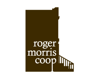
Description:
A co-op association in New York City.
As seen on:
Roger Morris
Status:
Client work
Viewed:
3059
Share:




Lets Discuss
Nice idea. Clever how you used the 'p' in 'coop' to convey a lamp post.
ReplyI dont see the Lamp-post
ReplyWell, it's not blatantly a lamp post. It just conveys one. Use your imagination. %3B-)
ReplyI see a lamppost... And I like it. But maybe a bit to visual for the target of the logo...
Replythanks! Do you think it would read more clearly as a street lamp if it were taller?
ReplyIf you moved your entire copy block up it would sell the idea of a street lamp more. Maybe add a oblesk to the top of the P as well.
Reply:( I still dont see the lamp-post, guys
ReplyPlease login/signup to make a comment, registration is easy