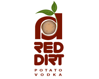
Red Dirt
by jenlogo • Uploaded: Jun. 20 '08

Float
(Floaters:
1 )
Description:
Proposal for a startup distillery in PEI.
Status:
Unused proposal
Viewed:
1748
Share:

Lets Discuss
Really love that red dirt line under the logo. Dont like the type at all. Perhaps the font used in the %22potato vodka%22 text could work better for a vodka distillery. I like the idea in the icon but think could be improved.
Replyok, thanks for your suggestion yorch:))
ReplyI think you can try to make the Ambigram from %22rd%22 text. That will look cool on the cap of the vodka bottle.%0D*Just an adivse. :)
ReplyPlease login/signup to make a comment, registration is easy