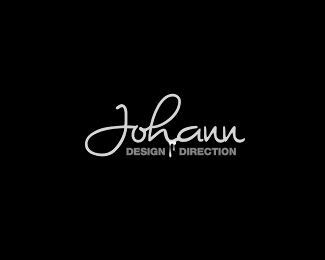
Description:
Personal Mark
As seen on:
http://www.johanndizon.com
Status:
Nothing set
Viewed:
2279
Share:

Lets Discuss
I would float this if the design/direction text, and the dribbly ink disappeared, because the johann font is fantastic as a stand alone in my opinion.
Replyi love it. the ink not so much... its a little brighter than the type and it kinda distracts me.
Reply@cerise,GabrielRO**It looks like the drip portion of the logo is a no go. I will play around with it some more.**Thank You for the great input!****
ReplyPlease login/signup to make a comment, registration is easy