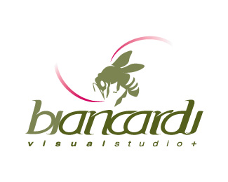
Dorade
by jbiancardi • Uploaded: Aug. 17 '09

Float
(Floaters:
1 )
Description:
Logotype,development for a beach clothing
As seen on:
www.biancardiestudio.com
Status:
Client work
Viewed:
2006
Share:


Lets Discuss
love the contrast and design layout. but i think in making the 'r' fit in just right, the readability is affected. probably a little more space would work. besides, the r is closer to the 'o' than the 'a'..
ReplyThanx for the comment
ReplyPlease login/signup to make a comment, registration is easy