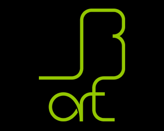
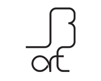
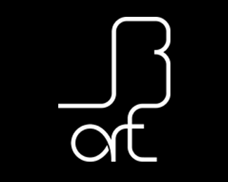
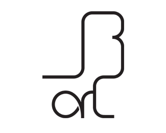
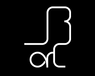
JB art
by jbart • Uploaded: May. 01 '15

Float
(Floaters:
0 )
Description:
I made this logo for me to use it as tag to photos, projects etc
Main idea was to make it simple with letter J and B first letters of my name and surname Second idea is to make it from one or two lines/curves that will intersect somewhere first curve from left bottom corner of J through B to the right bottom corner of t and the second from the inner circle of a through r to the upper line of t
Some of my friends told me, that I should remove the short upper line on the right side of t but I don\\\\t think it\\\\s a good idea, because nobody would then see that it\\\\s the letter t
I am looking for constructive critique, this is one of my first logos I really like and I hope it seems good
Status:
Client work
Viewed:
654
Tags:
jb;art;logo;logotype;student;first;critique;help
Share:
Lets Discuss
Please login/signup to make a comment, registration is easy