Float
(Floaters:
0 )
Description:
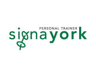
My design for a personal trainer identity.
Status:
Nothing set
Viewed:
2435
Share:
Lets Discuss
Interesting concept. If it were me, I'd work on the spacing of the letters in 'signa york'. The 'a' in 'signa' should move to the left. The 's' in 'signa' should move to the right. Have you tried tightening up the spacing between each of the letters in 'york' as well? I think your logo will be stronger then. No pun intended. :P
ReplyThanks for the feedback OcularInk. I think that your suggestions would work well. I'll have a look at those and see how it looks after.**Cheers 'J'
ReplyNice job. Have u tried inverting the thickness between signa and york? I think it could work better with the concept you developed.
ReplyHi reddskinn,**Like OcularInk thanks for your input. This might be another good suggestion that I should look at. I was thinking of making a little more of the dumbbell %22g%22 so maybe it being bolder could work better.**Thanks again guys for taking the time to leave feedback.**'J'
ReplyPlease login/signup to make a comment, registration is easy