Description:
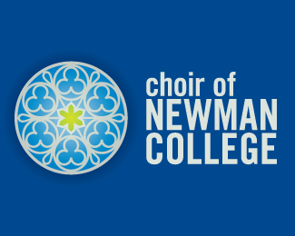
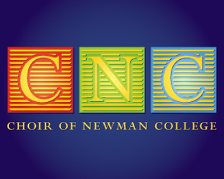
I have been asked to design a logo for a college choir in Melbourne. Not a lot of guidance was given, just that their colour was blue. The circular design that features in the designs was taken from their church chapel stained glass window - thought it might be a good look. You tell me.
Status:
Nothing set
Viewed:
1115
Share:


Lets Discuss
The stained glass mark is great but I feel that it could be stronger with more contrasting colours. A serif or semi-serif font would work much better on one or two lines and possibly placing the mark above the text.
ReplyPlease login/signup to make a comment, registration is easy