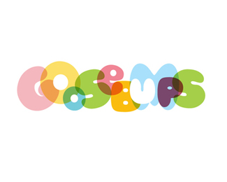
Description:
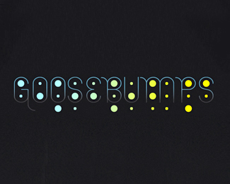
Goosebumps is a consultancy that brings creative agencies and clients together. Through a series of workshops, trust and friendship is developed - a platform for a strong future partnership. "Goosebumps" describes the natural emotion of fear and excitement in starting a new relationship.
Status:
Nothing set
Viewed:
12398
Share:
Lets Discuss
nice colors and overlays*
ReplyOdd name for a design consultancy ... I would have thought a children's clothing line.%0D*%0D*nice colors though:)
ReplyLovely design and a really cool name too.
ReplyVery nice colors, Great concept
Replyreally good, awesome colors
ReplyI like the colors and the design but find it too hard to read. Communication is pretty important for such a business. I also thought is was for a daycare.
Replynice portfolio Jared, I checked out your stuff over on Behance, really nice work. its always nice to find someone thats as good at designing marks and logos as they are working in print/web/package. nice work.
ReplyAll your comments regarding the type looking childish are spot on. That was my concern as well as my clients. The creative brief called for a %22playful%22 logo. This was one iteration that explored that direction. **Thanks for the comments.
ReplyI really like this, although I didn't immediately know by looking at the mark, exactly what the company was about, it was still nicely executed, good work :)
ReplyPlease login/signup to make a comment, registration is easy