jump
by janzabransky • Uploaded: May. 12 '09

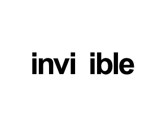
Float
(Floaters:
62 )
Description:
Houston-we inspired me. Just for fun.
Status:
Just for fun
Viewed:
5392
Share:


Lets Discuss
how lovely is this :D
Replycoooool - vetica
ReplyThan You Tass and Sergiu
Replyit's fun and works! good job!
ReplyI like it! My only criticism is that the dot might be a little too high.
ReplyThanks SpiffyJ, the dot is in the same height as is the height of the letters so I think its balanced.
ReplyThis is very creative. Reminds me of some type projects I worked on while in college. I immediately get a feeling of motion. Also, your reasoning for the placement of the dot is very smart. Nice work.
Replyman u rule!
ReplySo simple...yet so good!
ReplyOcularink/tokostyler/Brandsimplicity: thanks guys, really appreciate it
Replybeautifully simple and smart!
Replycool idea *catchy!
ReplyThanks Can
Replymasterpiece!
Replylovely stuff...
Reply@Lukasz @Paul - thanks guys.
Replywow .. it's cool!
ReplyOh gotta love this, I smiled as soon as I saw it.
ReplySo simple, genius!
Replyhah! I love this. Effective, efficient, and certainly intelligent. Reminds me of design in a simpler time back in the days of J M%FCller–Brockmann %3B)
Reply@Konrad @Enrique @Kibel @Jesse Thank You
Replythis is very elegant and lovely.
Reply@ Pierro, glad you like it.
Replysilly!....that's damn funny man....I do love it!
ReplyLovely
ReplyAwesome concept bud!
ReplyPlease login/signup to make a comment, registration is easy