zansal
by james_ • Uploaded: Oct. 31 '07

Float
(Floaters:
1 )
Description:
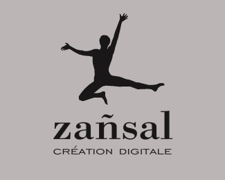
I've recently moved to Brittany in north-west France and I needed a creative identity that was recognisable and local. "zansal" pronounced je-on-sal (the tilde above the n makes it sound like ON)is the Breton word for dancing and singing. The dancer is attempting to make a "Z" shape - this was inspired by a book I read 4 years ago: "ABZ more alphabets and other signs". Great book. Typography is Bodoni and Helvetica Neue.
As seen on:
www.zansal.com
Status:
Unused proposal
Viewed:
4033
Share:


Lets Discuss
Nice and clean. Great rationale too.*I think you could work on the tag line. Any chance of the Helvetica type being a serif and black... maybe even just black might work.
Replykoodoz: funny - I had the tag line in black (and played with some serifs too) yesterday just before I submitted then had a change of heart.%0D*%0D*I'll give it one more go.%0D*%0D*You got a serif in mind or should I stick with bodoni?%0D*%0D*Thanks for the tip.
ReplyKeep it simple and stick with Bodoni. Reduce it a little as well, and maybe muck around with small caps as opposed to all lower case and/or lots of kerning on the tag line...
ReplyPlease login/signup to make a comment, registration is easy