


Description:
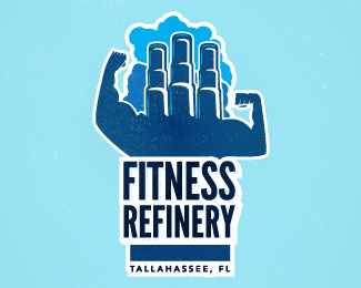
More Finalized version, shadow on the text isn't very visible at this size, but it's still there since the previous version.
Status:
Work in progress
Viewed:
4598
Tags:
training
•
personal training
•
workout
•
healthcare
Share:




Lets Discuss
keren bang :)
ReplyHmmmm... I don't get it. I mean...I get it I guess. But it feels way to forced in my opinion. The stacks and the arms just don't work together for me. But maybe that's just me.
Replywould make more sense to put a few stacks coming out of a single bicep rather out of the neck.
ReplyI don't think you need the white stroke around the entire thing, I think the logo would still feel connected without it.
ReplyPlease login/signup to make a comment, registration is easy