Federic Peretti
by isacrosta • Uploaded: Feb. 21 '08

Description:
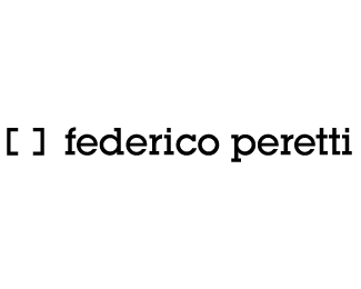
Logo created for a publicist/photographer. I decided to you that "square" to make reference to the camera (both, photo and video).
The typography I chose is, in my opinion, quite a masculine one and, at the same time, the serif gives it a little sofistication and detail (which is also important in his profession)
Status:
Nothing set
Viewed:
700
Share:


Lets Discuss
I like it a lot. The mark is an interesting take on the subject. The whole thing works well for me%3B only comment - Getty Images use Rockwell as their corporate typeface (not for their logo though), which might lead to confusion given that they are in the same market. But I wouldn't change it!
ReplyPlease login/signup to make a comment, registration is easy