Personal Rebranding - Fall 2012
by innov8ional • Uploaded: Sep. 06 '12

Float
(Floaters:
2 )
Description:
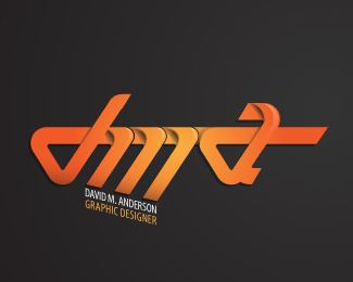
This logo represents a challenge presented to rebrand myself in a way entirely different from my current branding system. The result: this colorful, abstract graphic.
The colors represent the programs I use most often in my work and the warms vs. cools symbolize a relationship between my initials and my last name. The raw geode shape represents the beginning of an idea, the start of the journey of the creative process: a journey my work and skills intend to effectively complete for my clients.
Status:
Work in progress
Viewed:
1689
Tags:
vector
•
typography
•
type
•
icon
Share:

Lets Discuss
Please login/signup to make a comment, registration is easy