Description:
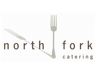
logo for a young, fresh catering company in montana. wanted to give a sense of direction without being too blatent.
Status:
Nothing set
Viewed:
1195
Share:
Lets Discuss
Blatent like a fork for a needle in a compass?
ReplyI think the fork it overpowering the type. and the shadow from the fork is distracting.
ReplyI liked it at first glance, but now that I really look at it, I can see what you need to do.*Make north, fork and the actual fork be on the same level. Then run catering all along the bottom of it. Play with the shadow to get some magic going. I can already see it. almost there in my opinion!
ReplyThe shadow of the fork points northwest and for some reason that's what I look at. I like the way it looks, but that messes up the concept a little bit for me.
Replythanks everyone. i think your advice is helpful. do you think the fork needs to be smaller? **stevie... why does the direction of the shadow mess up the concept?
ReplyPlease login/signup to make a comment, registration is easy