Calorie Counter
by infinitive_hu • Uploaded: Feb. 16 '10

Float
(Floaters:
0 )
Description:
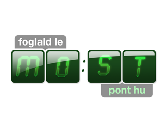
Logo for a calorie counter website
Status:
Client work
Viewed:
1998
Share:


Lets Discuss
The idea is alright, nothing special. Personally, I would change that top font, as it doesn't really fit aesthetically, or give off the right connotations. That shade of green isn't perfect either. It's a bit too turquoise.
ReplyThanks a lot, _blink, for putting your thoughts in this! I'll definitely give a shot at changing the colour. Not sure about the top font, though. I like it.
ReplyPlease login/signup to make a comment, registration is easy