by imyj • Uploaded: Sep. 30 '09
Add to Pad (In 6 Pad s )
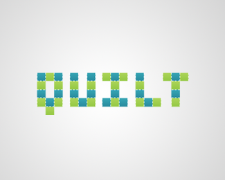
Description: steps Status: Nothing set Viewed: 1399 Share:
I like the concept. I think it would be stronger if you used straight angle typeface and steps.
I like it and agree with above.
agreed
Thanks guys. This logo just got featured on creattica.
To be honest i like the way it is too. The roundness give an old/romantic side to the stairs.
This concept looks like a rather established logo for the Reebok STEP aerobics system. Been around for quite awhile actually. **http://www.ginmiller.com/gmf06/gmf_store/workouts/step_reebok/the_video.html
Please login/signup to make a comment, registration is easy
Follow


Lets Discuss
I like the concept. I think it would be stronger if you used straight angle typeface and steps.
ReplyI like it and agree with above.
Replyagreed
ReplyThanks guys. This logo just got featured on creattica.
ReplyTo be honest i like the way it is too. The roundness give an old/romantic side to the stairs.
ReplyThis concept looks like a rather established logo for the Reebok STEP aerobics system. Been around for quite awhile actually. **http://www.ginmiller.com/gmf06/gmf_store/workouts/step_reebok/the_video.html
ReplyPlease login/signup to make a comment, registration is easy