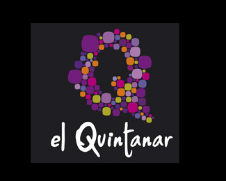
QUINTANAR
by ildebuenpaso • Uploaded: Nov. 02 '09
Description:
logo for a household in rural area
Status:
Client work
Viewed:
1049
Share:

Lets Discuss
I like the color scheme and shape of the Q! *My eyes keep looking at the the three overly large violet dots in the Q...IMO i would like to see them blended with the rest...but maybe it's just me. Is the client set on using that font?
ReplyThanks for your opinion, Q represents the facade of the hotel is the seventeenth century and is made from stones of different sizes and the client wanted to reflect the hotel's friendly treatment we did through the source, he agreed .
ReplyPlease login/signup to make a comment, registration is easy