Description:
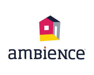
Design pitch for Romanian interior design firm. Is it good?
update:slightly more vibrant, redish color combo.
Status:
Nothing set
Viewed:
2600
Share:






Lets Discuss
I like the abstract look of the inside of the house. I'm not sure about the colouring. It seems a little bit ensurancy or something. The font is nice, maybe you can combine the dot of the 'i' with the mark? Just a suggestion...
ReplyI think it's quite an ambiguous mark in that you don't know if the red wall is protruding or receding - maybe this is intentional? I would define the perspective more strongly. Also, the 'i' dot is not bad - just link it to the mark by using pink instead of orange.
ReplyLiked this one on DZ as well. %3B)
ReplyI quite like this.
ReplyPlease login/signup to make a comment, registration is easy