Description:
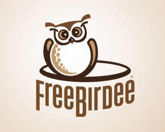
an update for this golf website logo ...
as suggested, no more legs but next to a hole, to look like as if it's a burrowing owl. What do you think, better?
Status:
Work in progress
Viewed:
3251
Share:




Lets Discuss
I didn't see the first version, but this one hits. Nice job!
Replythis was the first version%0D*http://dl.dropbox.com/u/3552160/zadz2.jpg
Replythis one's better, IMO. Have you considered making the type all uniformed in height? Anyway, nice work.
Replyhere's the updated typo%0D*http://dl.dropbox.com/u/3552160/FreeBirdee12b.png
ReplyPlease login/signup to make a comment, registration is easy