Description:
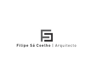
Simple geometrical logo for an architect, he asked for no color and rigorous geometry.
As seen on:
http://www.logotipo.pt
Status:
Client work
Viewed:
5775
Share:



Lets Discuss
Nice mark. Are those the letters FSC in there? Well a backwards C really, but still a C.
Replyyeah that was our intention to construct a monogram over a square.I'm glad it worked whithout specifying it in the text %3D)
ReplyThis is quite nice.
ReplyYes it is.
ReplyPlease login/signup to make a comment, registration is easy