Description:
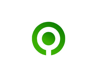
This is a logo for a young starting architecture studio, they wanted a strong geometrical based symbol to post on all their stationary and project sheets, they asked just for an icon with no typeface title, it has to represent the philosophy and design of the studio with just the symbol, the letter "Q".
As seen on:
http://www.logotipo.pt
Status:
Client work
Viewed:
4057
Share:
Lets Discuss
great concept!
ReplyIf it's to represent 'Q' then rotate the outer circle to have the space where the angled line connects to the circle to make a 'Q'.
ReplyThat %5E would be to obvious and make the logo largely unremarkable.
Replyyeah, we thought of twisting it 45degrees but it's stornger and more abstract this way, there's many Q's with a vertical leg also %3D)
ReplyI think relate has a good point....and I see what epsilon says, too...but really, the mark as is is, well...um...not 'shouting' the letter 'Q' either. Looks like a tree or a 'power on' symbol. Sorry, ep, not to disagree with you harshly, but relate brings up a good point.
ReplyPlease login/signup to make a comment, registration is easy