Description:
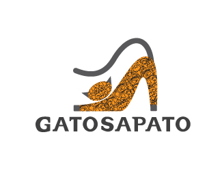
This is a logo for a fashion designer site. GATOSAPATO means literally CATSHOE and so we conceived a symbol that looks at the same time a cat and a pump shoe.
As seen on:
http://www.logotipo.pt
Status:
Nothing set
Viewed:
12950
Share:



Lets Discuss
wonderful!
ReplyI'd like to see this mark in solid black with a subtler tail which could double as a strap. Nice idea.
ReplyYes, yes what firebrand said. This has the potential to be world class.
Replyyeah, we tried to make the tail as a strap but it didnt look well proporcioned, we aren%B4t really happy with the type also, we'll change it possibly.**tanx for all your comments, we are trying to grow as designers and logo pond is really a good source of quality inspiration.**best regards
Replyvery similar to this? http://www.crestock.com/image/1659806-White-cat-silhouette-for-your-design.aspx
Replyi don't think that is similar, we simply used a normal cat pose to recreat a pump shoe form. off course this is a very common pose for a cat when it is stretching after a nap %3D)
ReplyIdeoma, Who are you trying to kid. %22your%22 logo is on P. 103 from %22Design Matters// Logos by Capsule Design, Published by Rockport. You are the second person to magically come up with the same concept on these pages.
ReplyCalm down topfuel! Don't accuse someone without proof, you're talking about the %22gatosapato%22 logo or our own, the tricolor ring?**We can assure you that we didn't copy anyone, we start all our works with pencil and paper so i admit it can be similar to another logo that you've seen in that book but i have to see what you are talking about. *We allready looked for the book online but couldn't find it in pdf, we'll search for it in a store and them we report to you what we found. cheers and chill %3DD
Replybefore someone accuses us of copying this concept that i found on the melissa website i post it here %3D) *http://www.melissaplasticdreams.com/img/anuncios/anuncio/vinyl.jpg*it seems the cat-shoe is a very common idea in the globe!
ReplyJust my humble opinion but I think that texture in the cat is just out of place, it just jumps into my eyes.
ReplyHere's another one: http://www.toxel.com/wp-content/uploads/2010/04/logo20.jpg
Reply@ivishga, the texture works better when the logo is bigger, it was kind of a client demand... http://www.gatosapato.com/ in the shop website you can see the final version of this logo with a different kind of type more suited for the mark I think.**@ru_ferret, it's terrible to think you're beeing really original and clever and then you discover you weren't the only one %3D)**Thanks a lot for your comments
ReplyPlease login/signup to make a comment, registration is easy