Description:
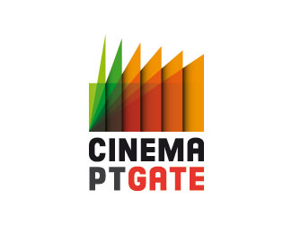
Turned down logo for a cinema news website.
As seen on:
http://www.logotipo.pt
Status:
Unused proposal
Viewed:
1851
Share:
Lets Discuss
Don't take this the wrong way but it looks like a saw blade.
Reply%3DD yep didn't see that coming! but do you understand what's the intention?
ReplyYes, good idea with the seats, auditorium and projector beam - its unfortunate that I registered the saw blade first.
Replyit's one of those failed attempts to be original %3D)
ReplyIt happens. Keep going :)
ReplyJust idea, what if projector beam was symetrical as triangle?
ReplyPlease login/signup to make a comment, registration is easy