CKE Logo Concept
by iashraf • Uploaded: Jun. 22 '10

Float
(Floaters:
1 )
Description:
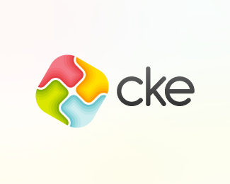
This was the original concept mark for the new CKE Logo, which is shown here: http://logopond.com/gallery/detail/107988
What do you think?
Status:
Nothing set
Viewed:
2301
Share:
Lets Discuss
Some things to note: there are three strands of the CKE. One is e-learning, which is represented by the blue colour, the second is the CKE events, which is represented by the orange, and the last is the CKE green (low carbon, renewable energy focus) which is represented by the green.**These individual colour schemes will be used for marketing material for each strand, and come together to form the CKE logo.**Please comment on the CKE logo which was derived from this concept - http://logopond.com/gallery/detail/107988
ReplyPlease login/signup to make a comment, registration is easy